introducing: windsor park

it was all about the art, at lovely windsor park…

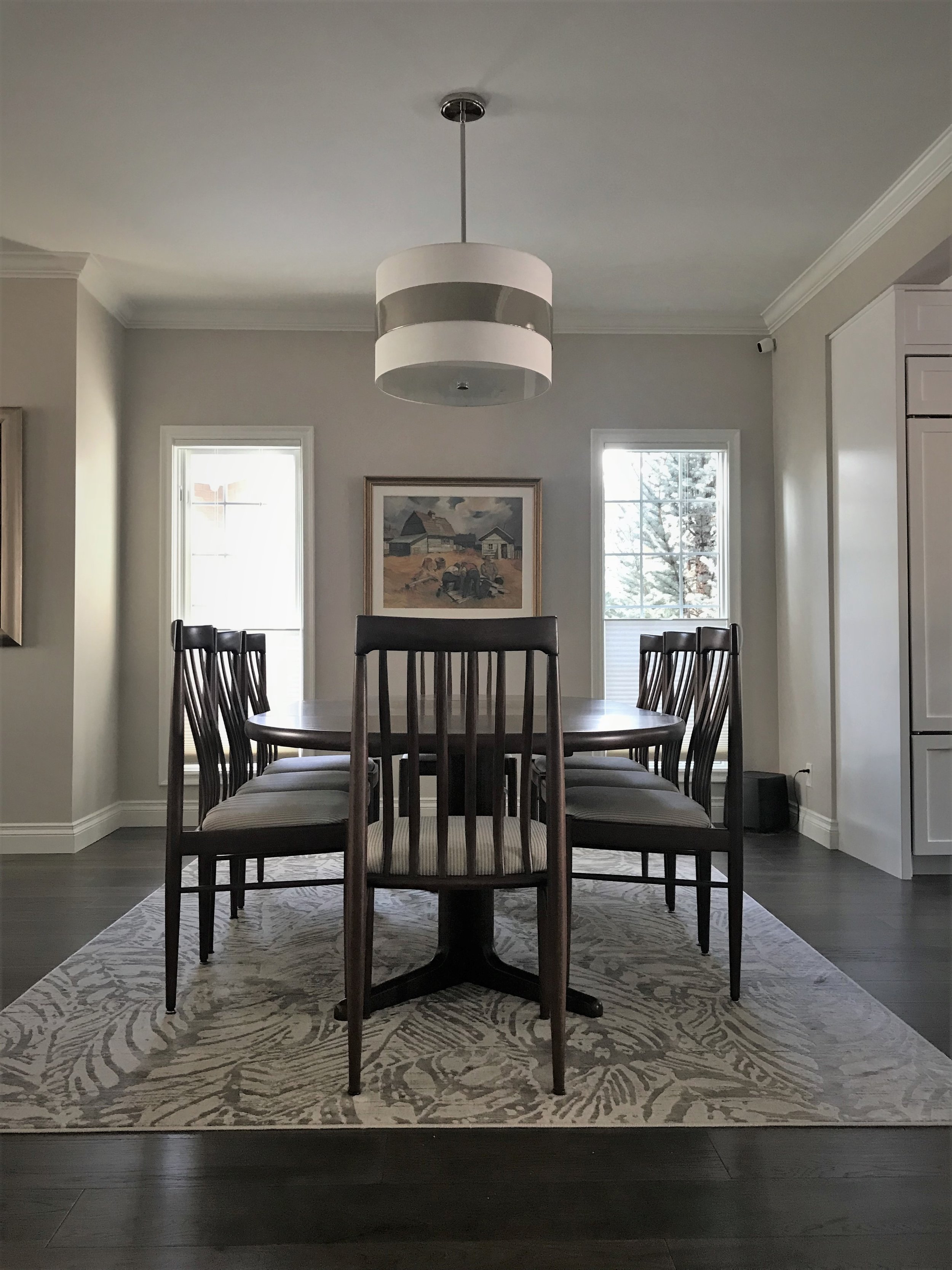
has a nice ring to it wouldn’t you say? ;) well, it certainly was true. there was no doubt that the wonderfully curated collection of these long time clients deserved to sit center stage - and stage left, and right, and just about everywhere we could find available wall space!? we didn’t spare an opportunity! #truestory

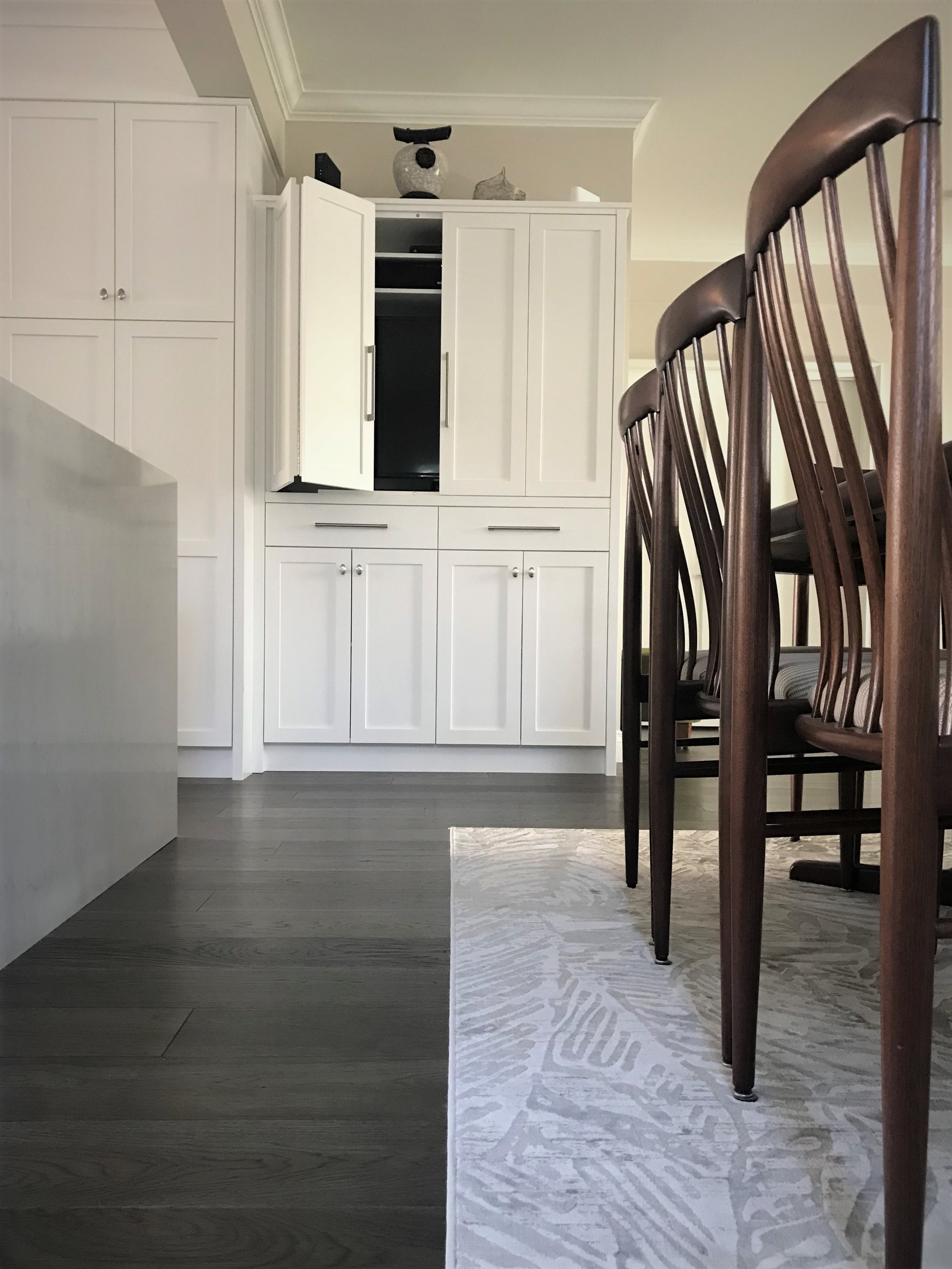
with that ‘emphasis on art’ in mind, our chosen finishing & furniture for this extensive renovation, was meant to provide a classic, comfortable, & subtly serene backdrop to that which would fill it…  yes, the art… but also, most importantly, the growing extended family of children and grandchildren these homeowners were keen to play host to in the coming years! the other design requirement: there needed to be room for everyone!

as such, a family friendly and yet comfortably sophisticated space emerged… all at once, cozy enough for two, and spacious enough for a crowd!

welcome to windsor park

introducing: riverdale

well what can i say about riverdale?! to be honest, this little project was a joy for many reasons, not least of which would be the darling clients i had the chance to work with :)

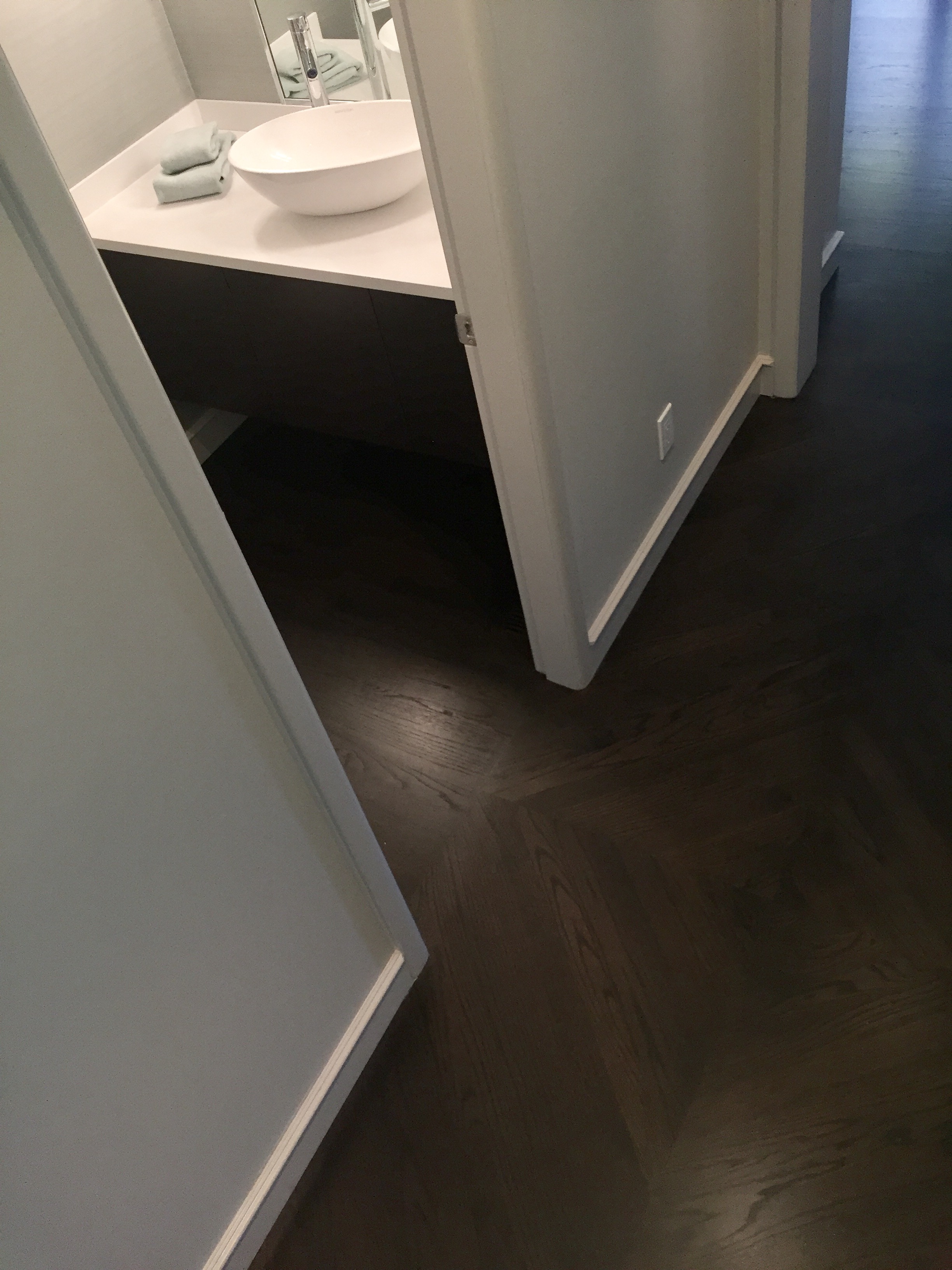
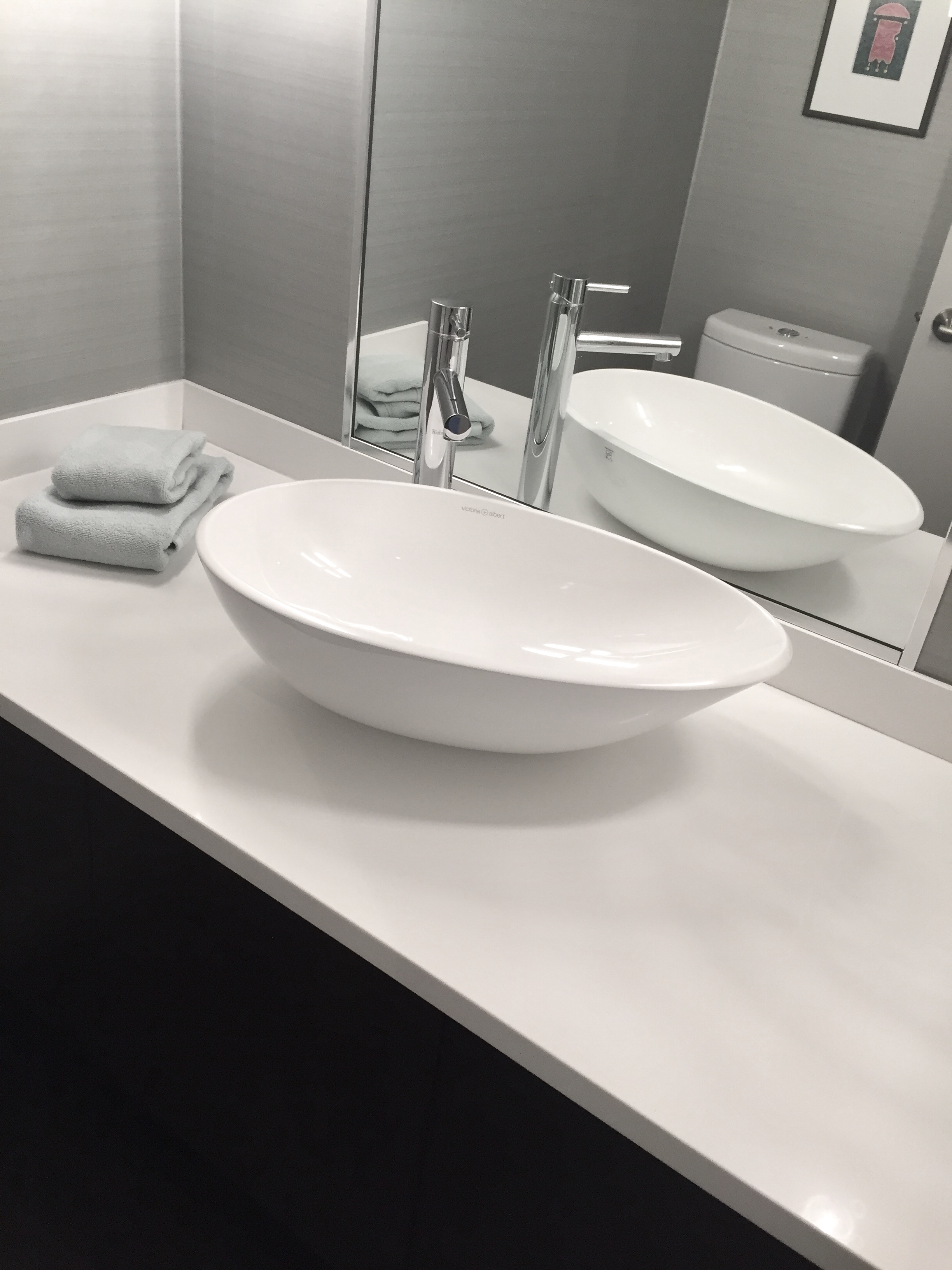
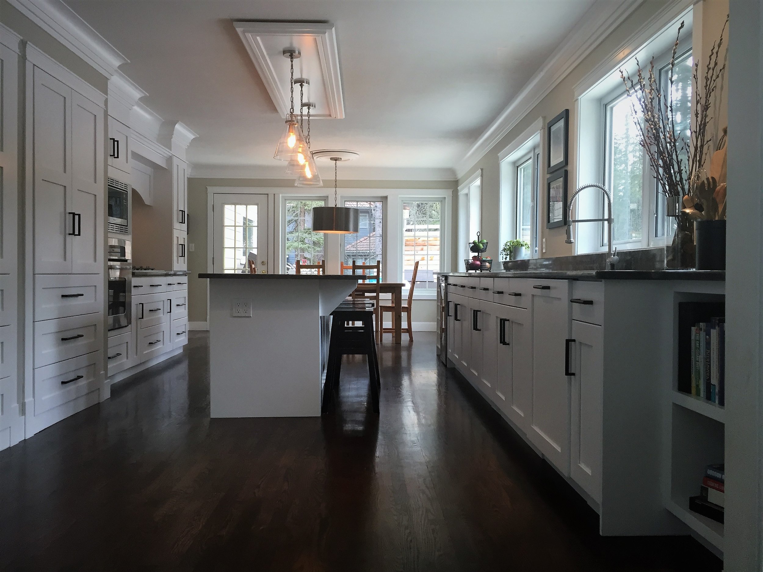
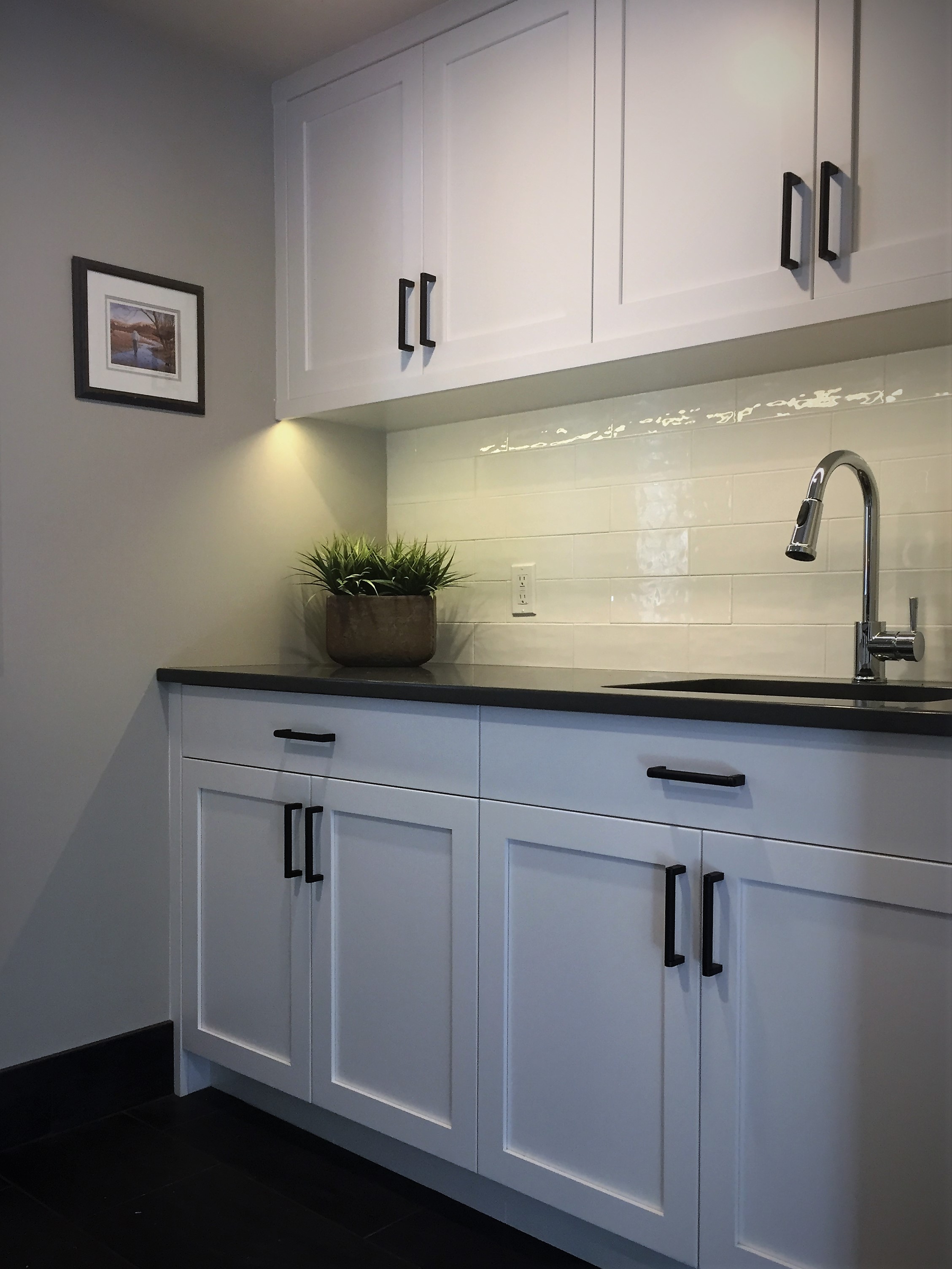
soft spoken in nature, yet steadfast in their preferences, they had a simple mandate: to update the tired 60's kitchen and powder room on the main floor - and refresh the original hardwood to a striking new stain.  a simple palette of serene whites and rich ebony are complimented with soft grays & greens throughout. fresh and modern fixtures completed the look - resulting in this simply sublime space that perfectly mirrors the clients tastes and preferences! 

in partnership with the talented guys over at willowbrook homes - this renovation was completed spring 2017 and will now be enjoyed by the homeowners for many years to come!

welcome to riverdale!    

introducing: bragg creek

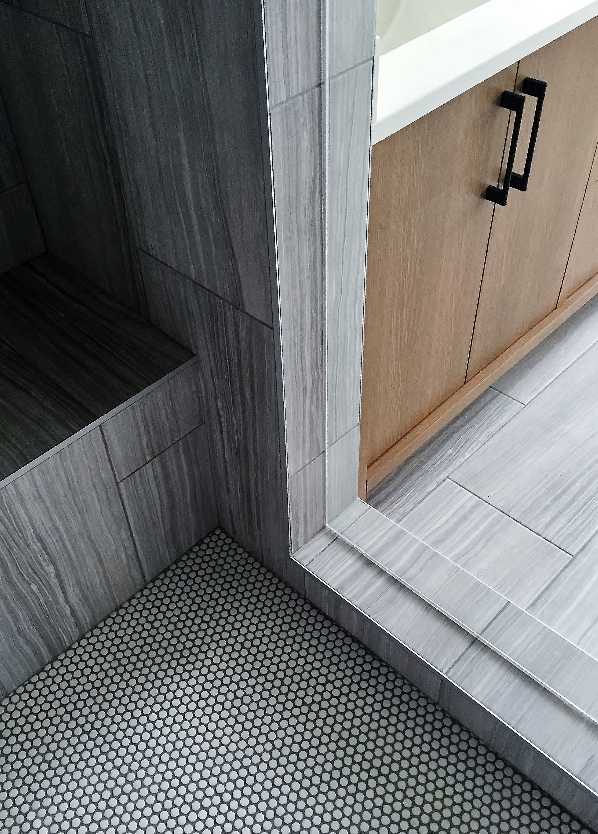
nestled in the foothills just west of calgary lies the charming little hamlet of bragg creek... rich in both character and community, it is here that i was fortunate to be introduced to this equally charming family - who were seeking some very practical improvements to their cherished acreage. situated on a lovely lot, their home had "good bones" one would say... with a generally good layout and generously sized rooms throughout. but it was not without a few pain points! with a wish list in hand, we set out to create some better functioning spaces - with the added bonus of getting a sweet little face-lift for the rest of the house along the way :)

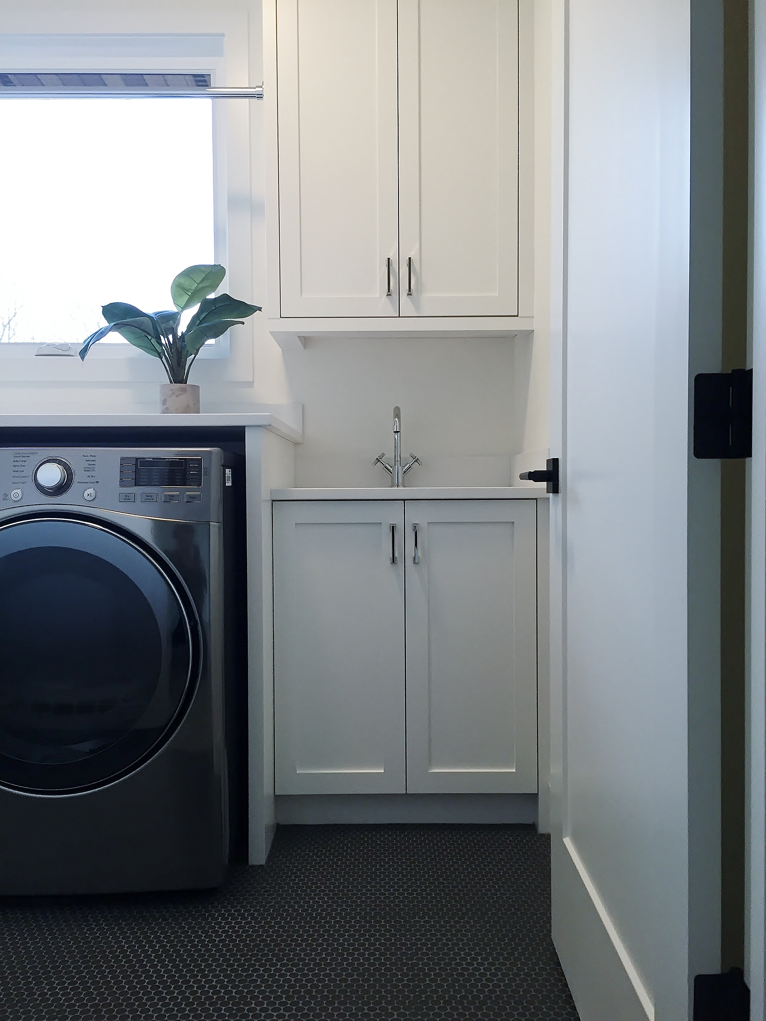
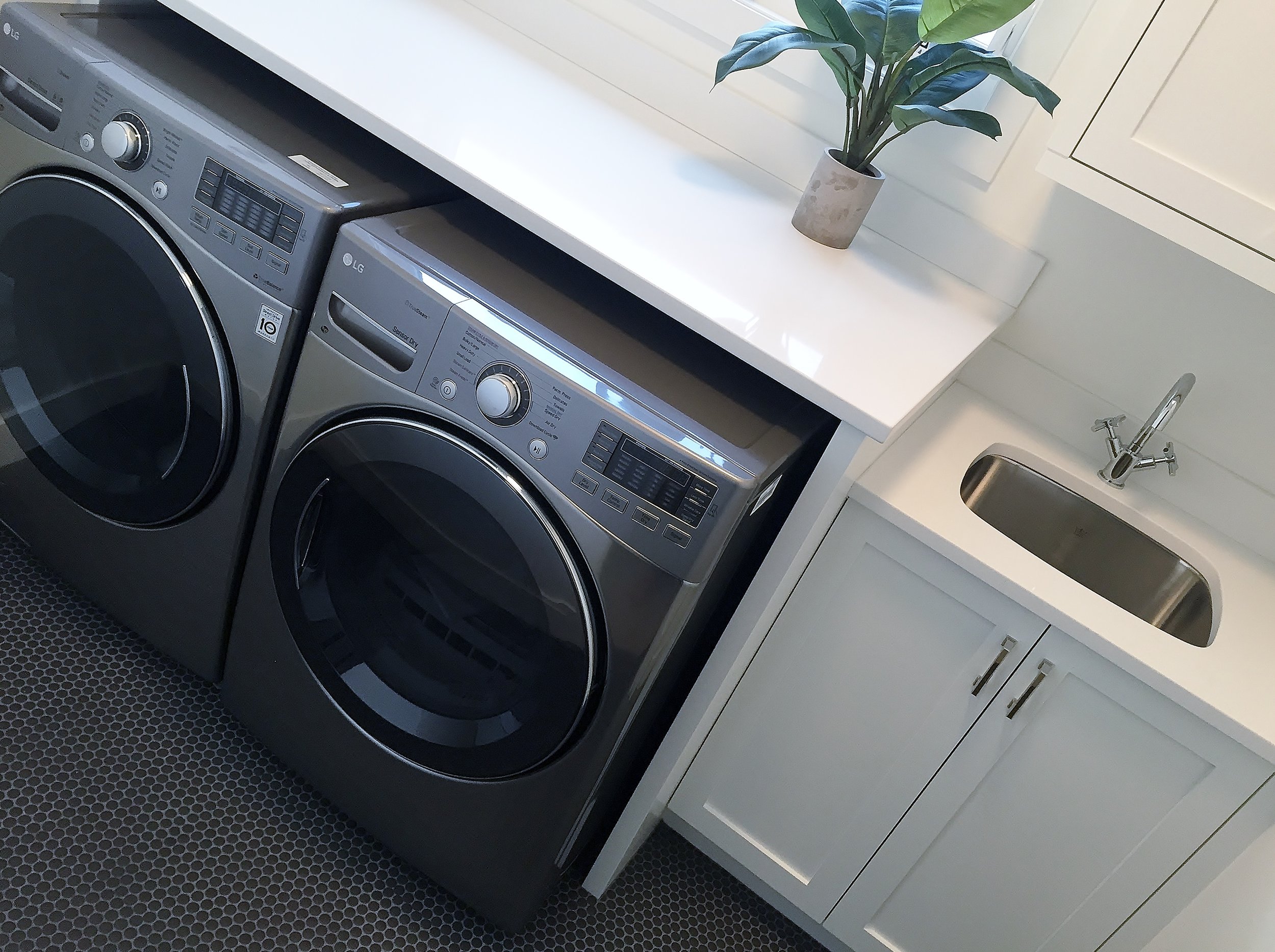
the biggest part of the renovation happened to be at the primary point of entry for this busy young family: the mudroom (or lack thereof?!), where they needed a better functioning space that  was to include the family laundry area, storage for all the coats/shoes/and sports equipment that inevitably needed to be controlled here, as well as providing overflow pantry space from the adjacent kitchen, and also as well, a dedicated homework room/craft area and family charging station/message central...?! all in just under 300 square feet!?! challenge accepted ;)

on top of all that, their list included a complete master suite refresh, fresh paint throughout (goodbye oak trim! hello wonderful white!), new hardwood stain, new carpet and some new light fixtures here and there! all things considered, we were able to refresh the whole home on a relatively modest budget ;)

but nowhere did we see the effects of this modesty more than in the kitchen. never part of the original scope - it slowly became apparent that with all the action going on around it - we couldn't not spruce it up too?! by completely refacing the existing cabinets, utilizing a few key changes/updates to the cabinets as they were, and surrounding everything with fresh finishes and fixtures - we were able to create a pretty impressive transformation?! resulting in a space that now looks and works as good as all of the new changes going on around it :)

completed with the talented and true guys over at willowbrook homes, this recent renovation offers just the right mix of rustic charm and modern sensibilities.... creating a home for this family of four that they could truly live in - and couldn't live without!  

welcome to bragg creek! 

introducing: killarney, part II

with typical back to school gusto - i am fi-na-leee revisiting some project photos that have been sitting by the wayside through the always active spring and summer months?! something about the crispness in the air and turning of the leaves (yes *sigh*, already!) make the annual event of "back to school" something that has never left me, even after i left school myself?! i've always enjoyed this time of year - bringing with it a return to ritual, where we all collectively "get back to it" and "hunker down for the year ahead"?! 

so without further ado; let's do this :)

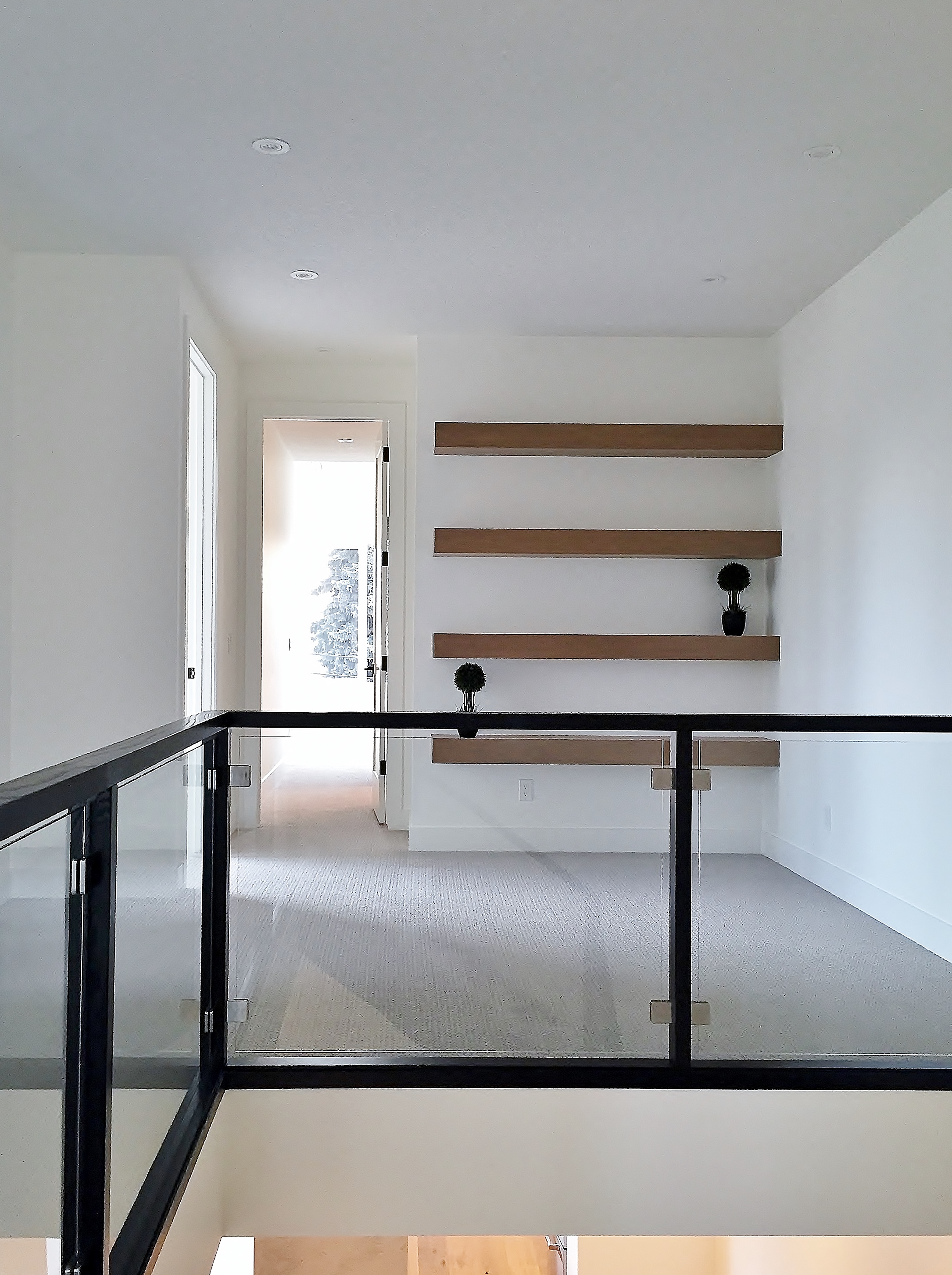
returning to killarney first, i present the other half of our modern day duplex.. located in a desirable inner city neighborhood, this side of the project was strictly designed and staged to sell; funky fixtures and a clean aesthetic create an easy and accessible modern style for potential buyers...! combined with the quality finishing and workmanship of our talented team of architects and builders - it's no wonder this unit was but a flash on the market ;)

welcome to killarney, part II

introducing: killarney, part 1

you know how they say... two halves make a whole? peas and carrots? yin and yang...? here in calgary, the urban development equivalent may well be: infills. increasingly popular, they create density on desirable (and larger!) inner city lots, replacing the often small and dated single family homes that once resided there. they have become our modern day duplex!

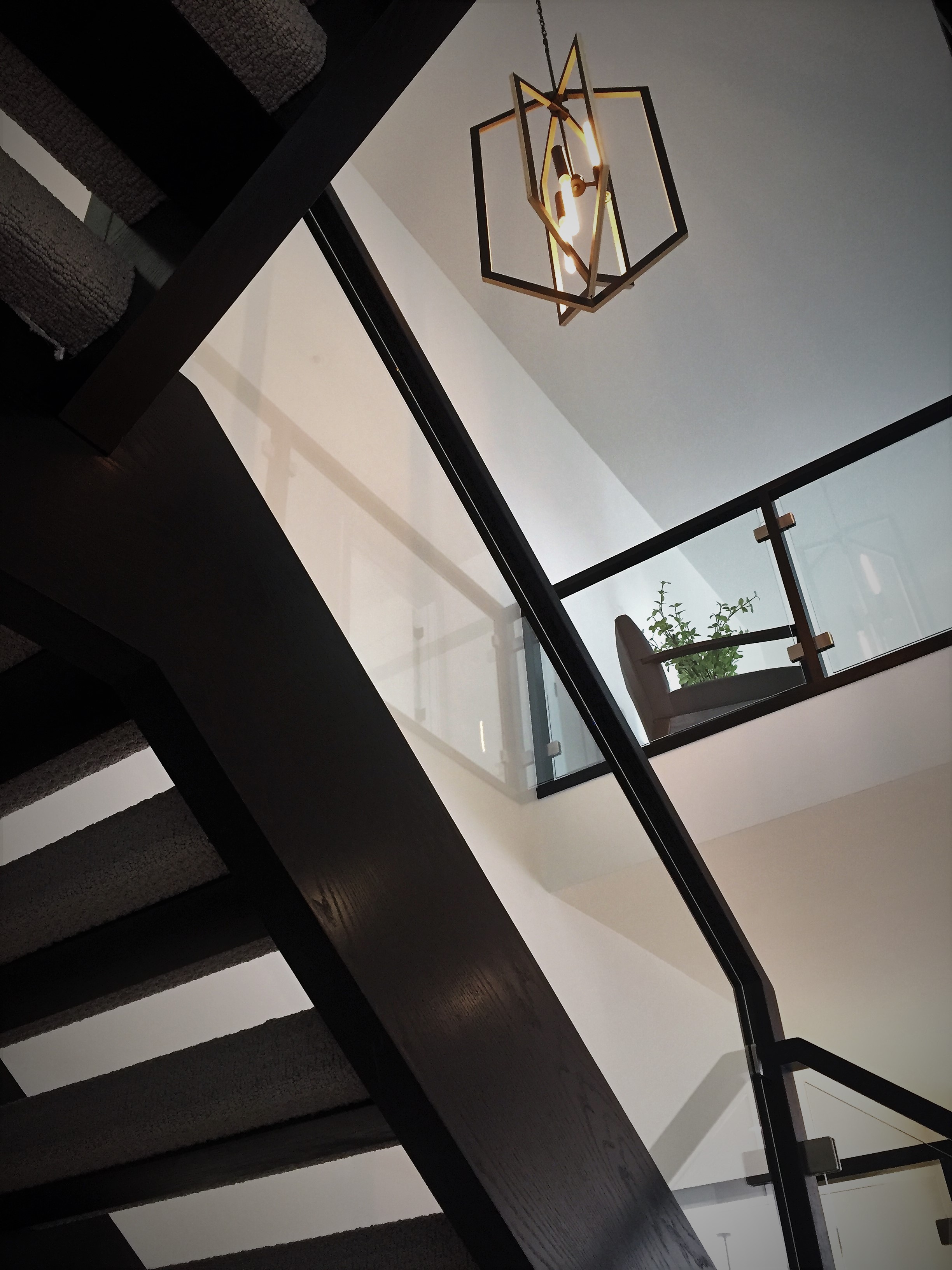
this infill project - completed with a a talented team of architects and builders - is located in killarney... and is the first half of this design duo! filled with warm woods and a classic palette of black, white, and shades of grey; then layered with fresh and fun fixtures throughout... this side holds it's own - and presents itself with a more classic appeal - creating a perfect counterpoint to it's sister half (the funkier of the duo) - due to be complete in the coming weeks.

for now, welcome to the first, the peas, the yin if you will... or... let's go with killarney, part I ;)

introducing: vita diagnostics

once again, i am pleased to introduce another of my collaborative projects - created together with the ever talented tracy wharton of dovecote design... by combining our varied strengths we are able to offer spaces that are thoughtfully laid out, functional and of course, aesthetically pleasing! the latter quality i must credit tracy for in full :) 

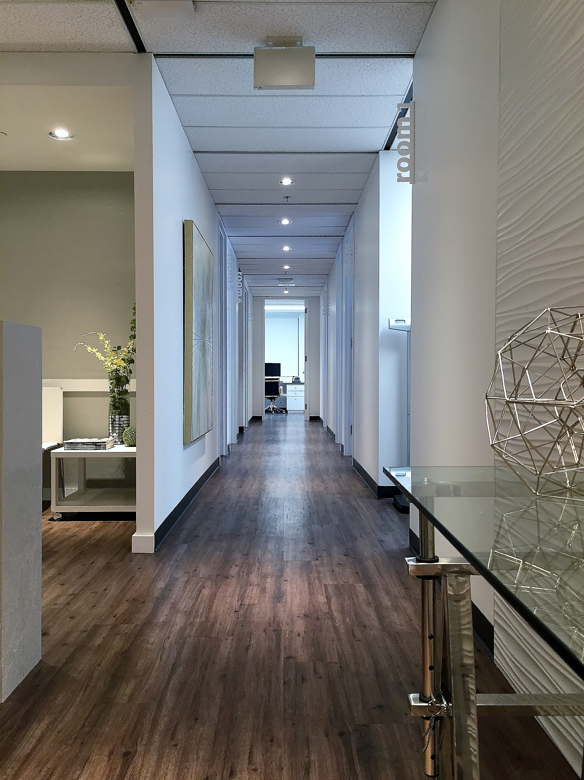
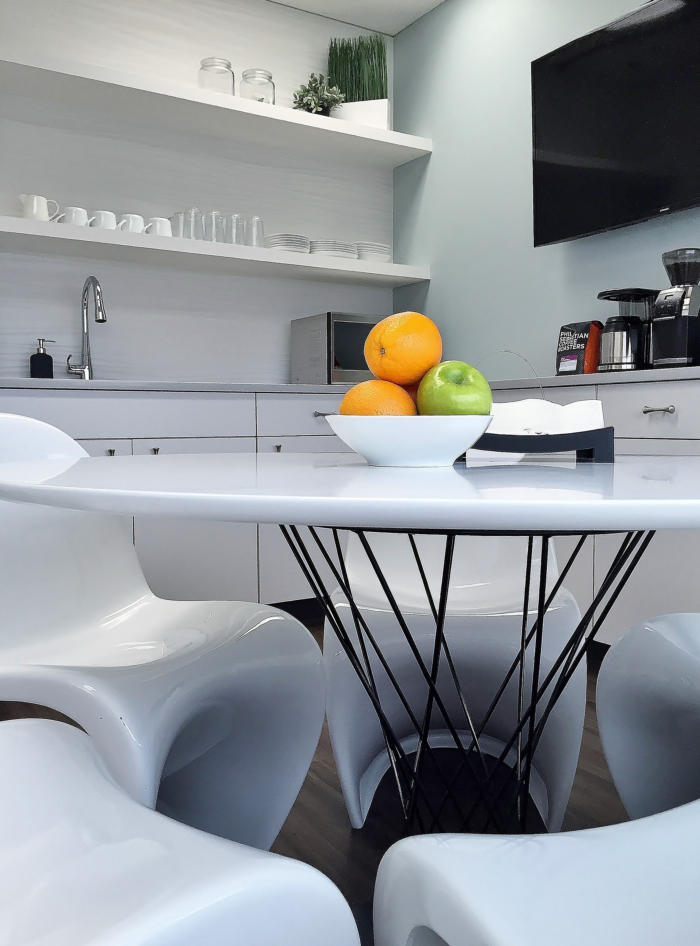
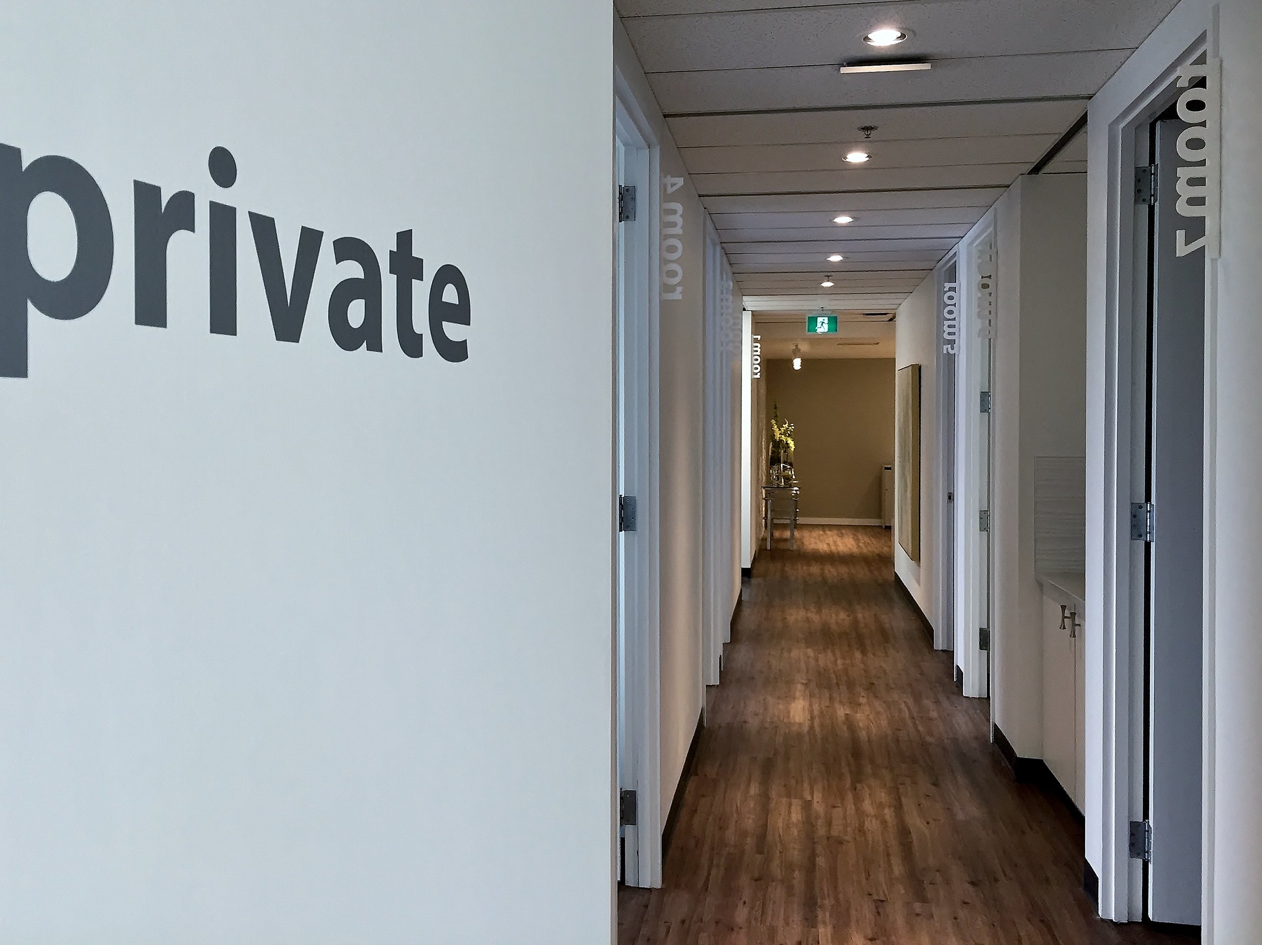
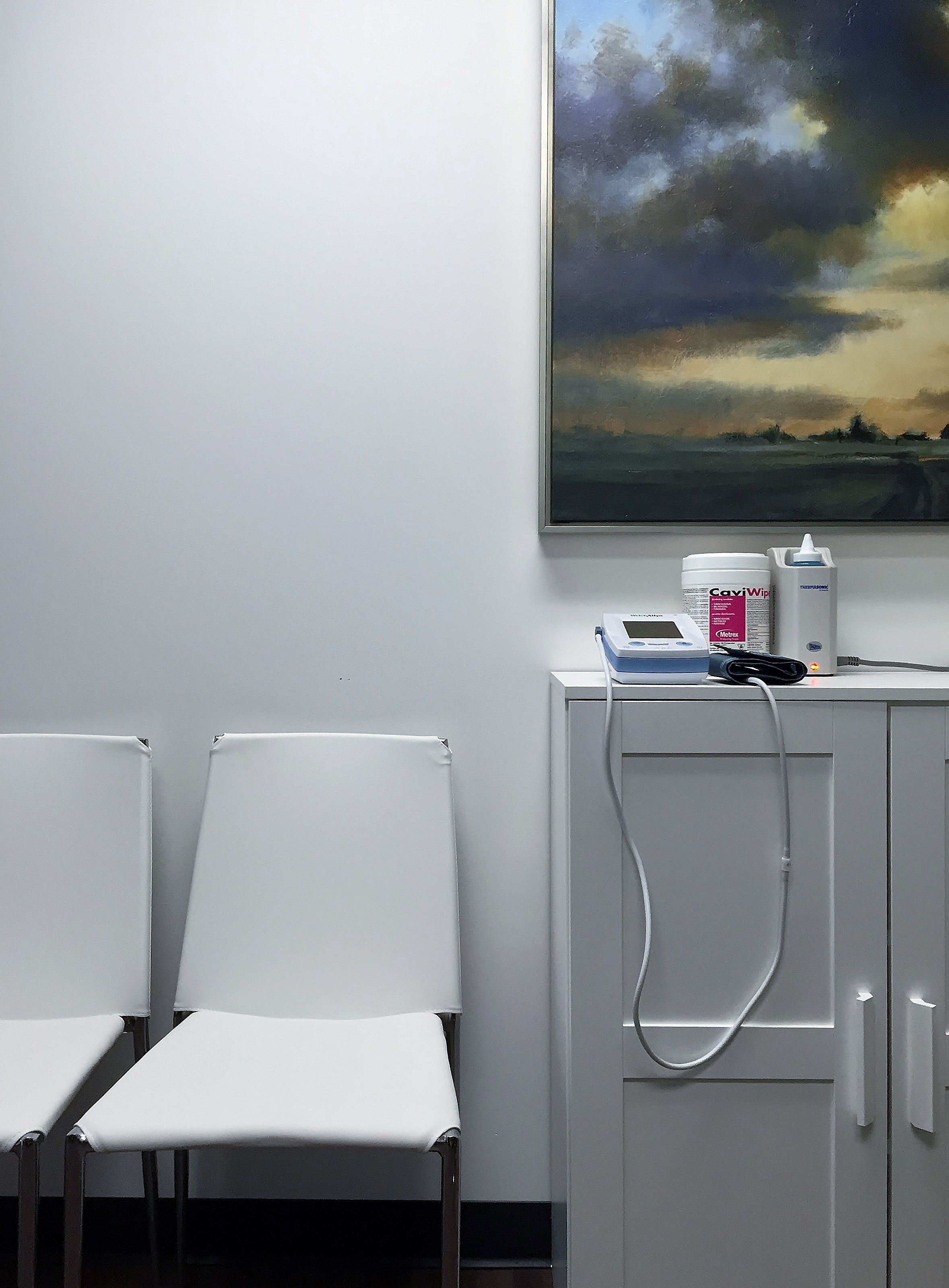
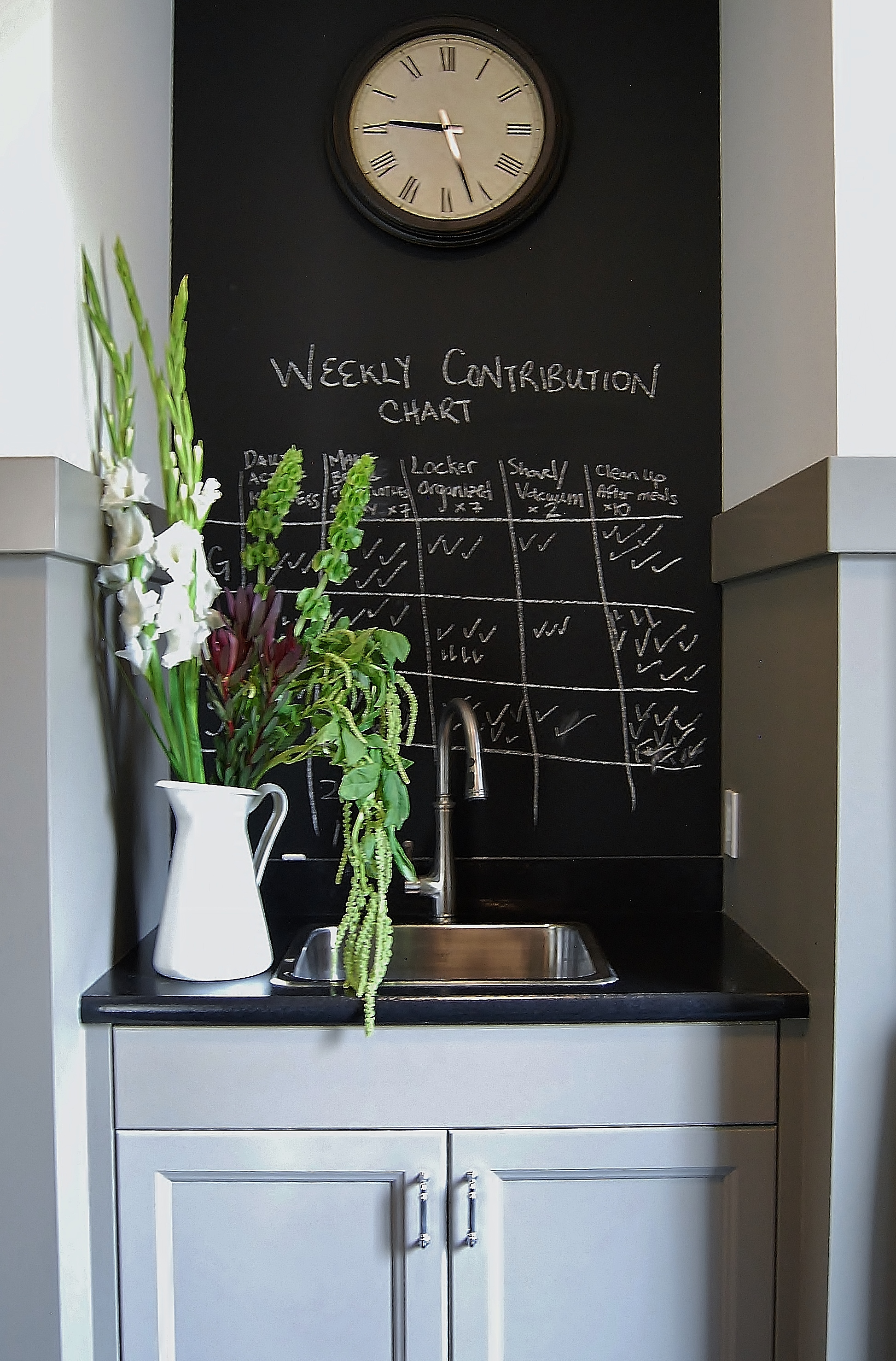
this time, our design collective was tasked with converting a tired & drab office space into a bright and inviting oasis for the doctors, patients and staff over at vita diagnostics. by reorganizing the interior space we were able to maximize the views and create an inviting experience for all. then layered with a serene & tactile palette of finishes, furnishings and art - this space is sure to make your stay a comfortable & pleasant one.

welcome to vita diagnostics!

project profile: kelvin grove, part 4

and just like that, she was done! *sniff*

when a project comes to it's inevitable close, it can be a bittersweet event.. so sweet in that all the hard work for everyone involved has come to fruition (always exciting to watch!); and even more sweet that the homeowners can finally settle in to life in their new home! but after all that time together as client and designer, it's often sad to part ways so abruptly?! such was the case when these folks moved in last winter :) 

with the hustle and bustle of the holidays and a equally busy start to the year, it took a few months for us to get back and properly see how much kelvin grove has grown into a proper home...! i think a home's true beauty comes with age - and the luxury of time to collect and curate all the pieces that you love! but when starting from scratch, it's important to lay a solid foundation of fixtures, finishes, and furniture upon which to build your decor... so you can eventually layer in reflections of  all the individuals that reside within!  

our last photo shoot of this beautiful family home focused almost entirely on the incrédible lacanche range... this one however is meant to offer up the rest of the rooms for your perusal...! take you on a virtual tour of to see just how much this house has become a home...

welcome back to kelvin grove :)

project profile: springbank, part 2

and then it was june...?! time sure flies when you're doing a renovation!  

life in springbank has literally been coming to life this spring! alongside the blooms and buds forming outside, we've been busy having the finishes and fixtures take form inside... and it's been a wonderful transformation to behold! 

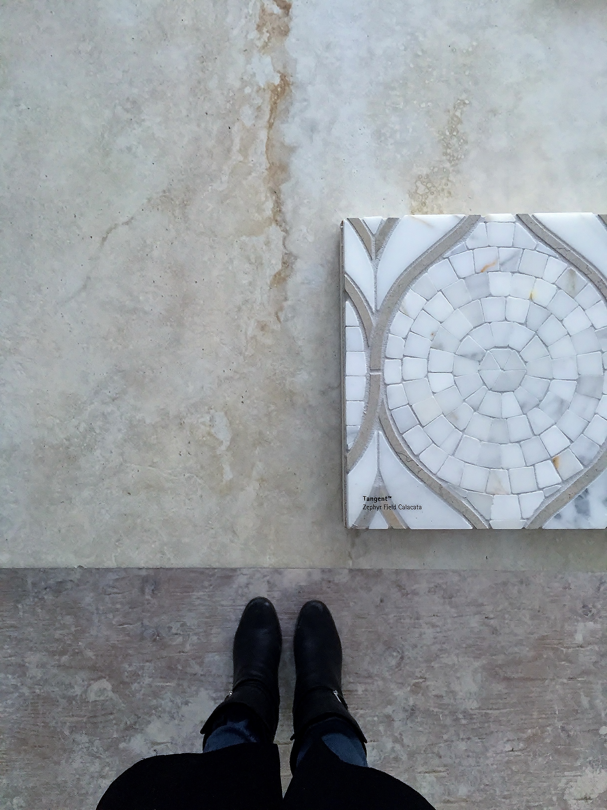
the finishing stage of a project is the home stretch, and it's always rewarding to watch it all unfold...  it is here that we truly see the vision we'd set in place months ago unveil itself. for this particular job, that meant we were now witnessing the creamy & statuesque stones for the counters, fireplace and tile connect in earnest with the rich woods of the floors, beams and finishing millwork throughout; and the soft curves and subtle palette selected made for a sweet & serene marriage of materials :)

summer is now upon us and springbank is near complete...  this (patient!) family of four will be moving in this week and i cannot wait for them to finally settle in to life in this mediterranean inspired gem! our final reveal is coming soon so i thought we'd better get this little taste of whats to come out and noted... stay tuned for part 3!!! :)

project profile: springbank, part 1

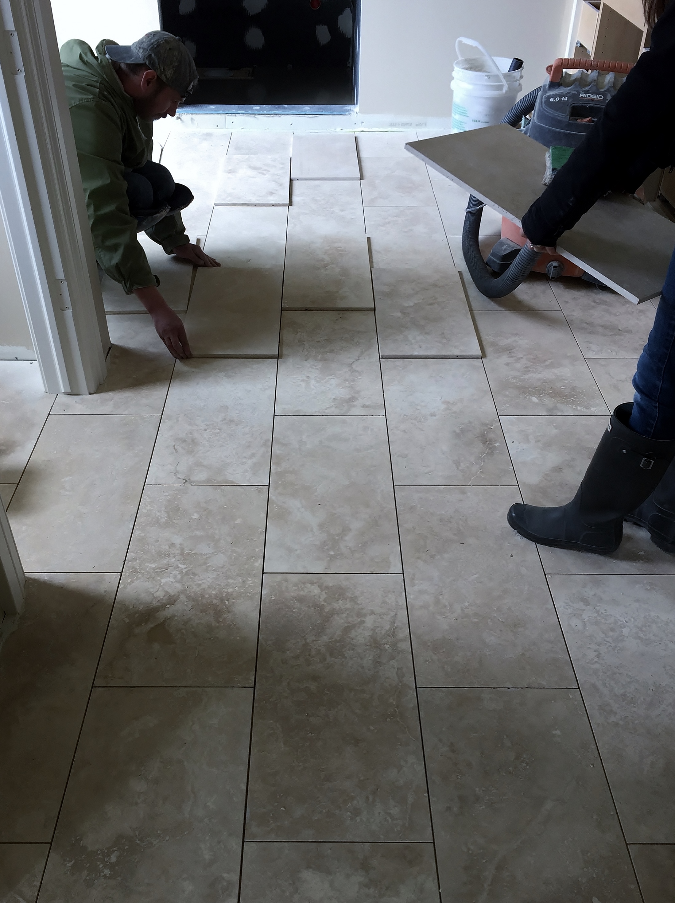
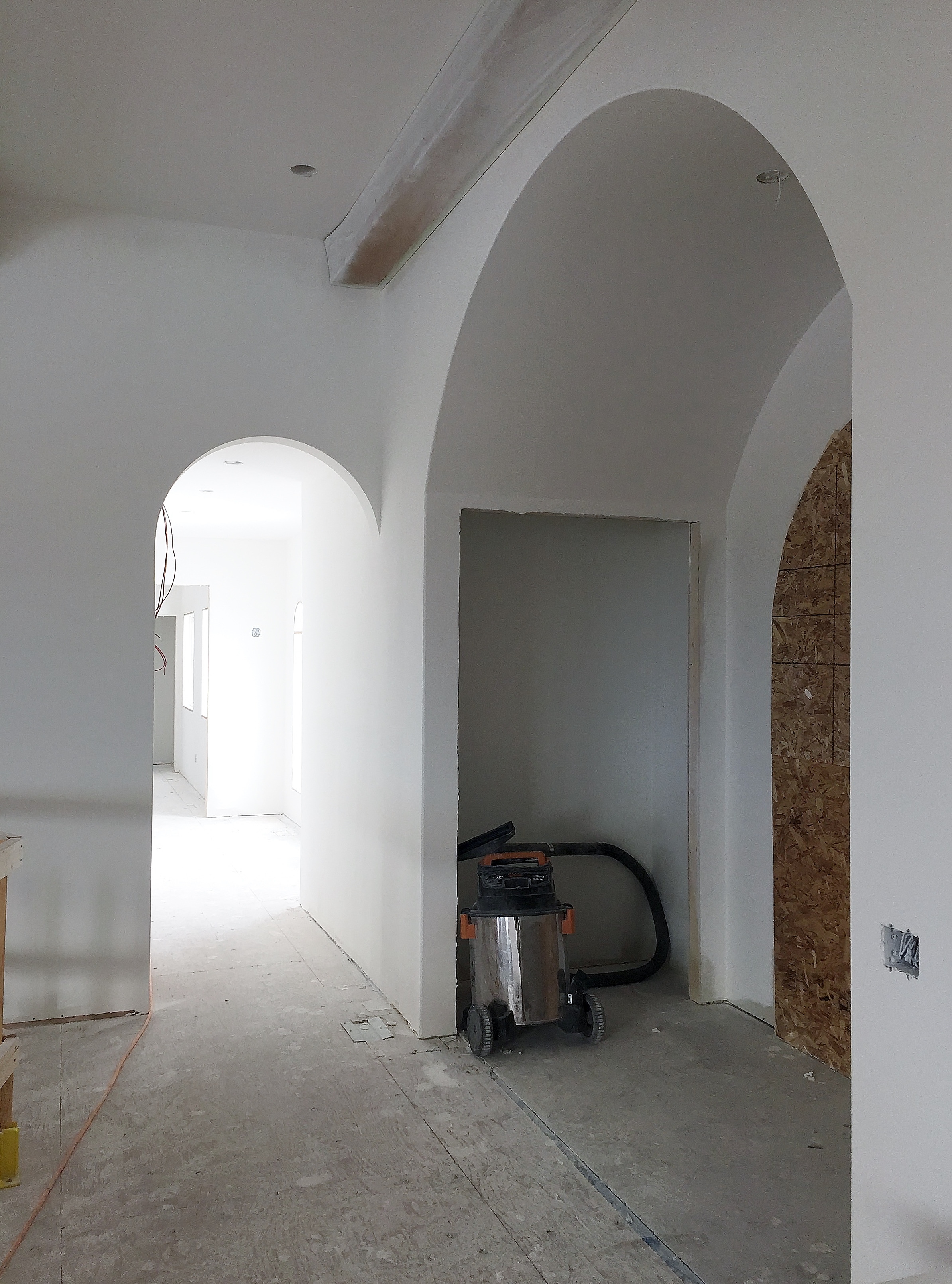
when planning a renovation, one of the first things we look to are the existing architectural features of a home - and how they might drive the design. some things you can (and want to!) change with the new design - but when considering the bigger picture of style, structure and budget - it's sometimes best to play the hand you're dealt...

in this case, the hand we ran with were the ever present arches on this springbank residence... and run with them we did! already present in most of the windows - integrating this feature into the new design became an easy move... and soon after a distinctly mediterranean flavor was revealed! 

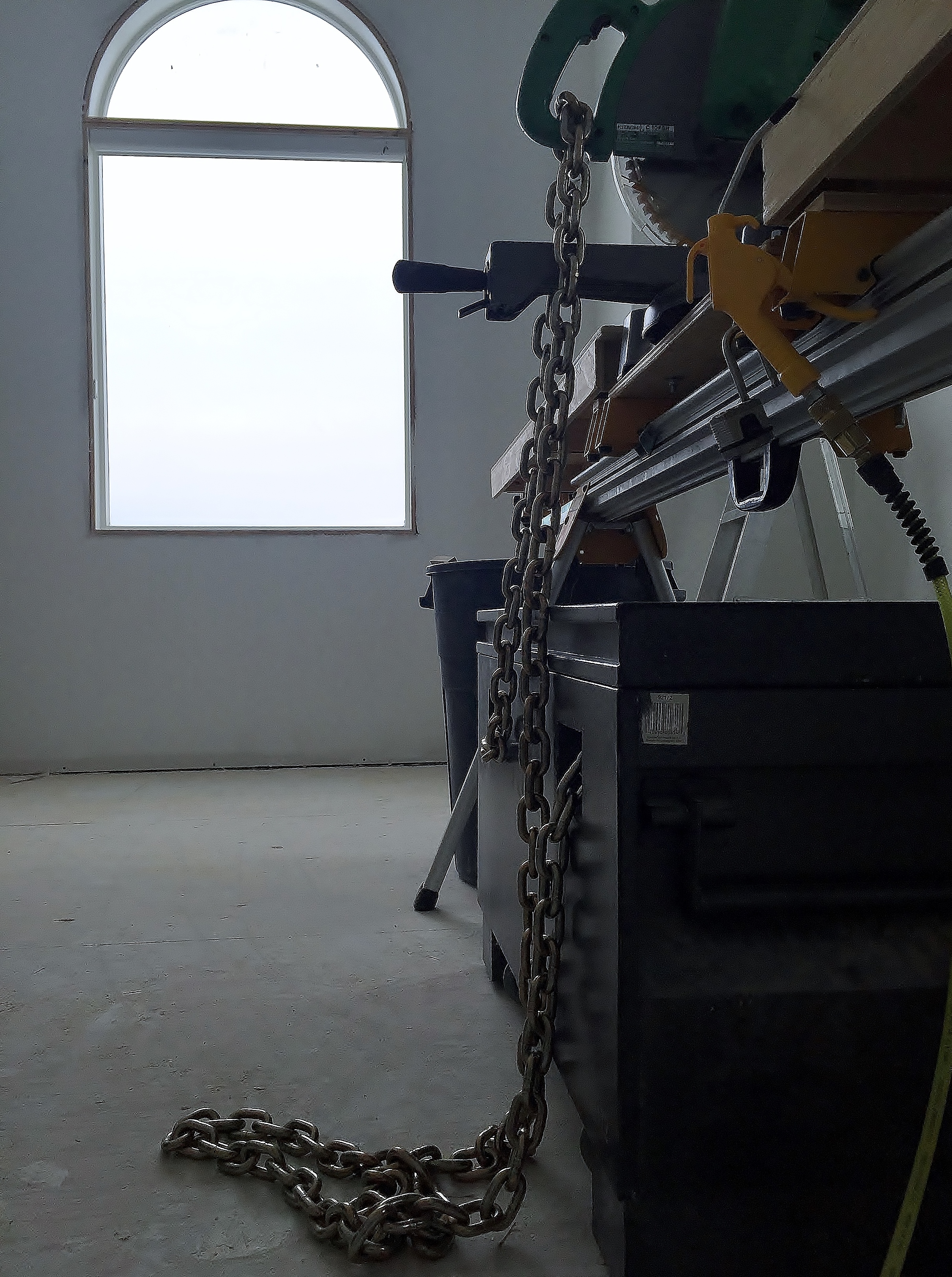
now well into the renovation process (cabinets are going in as i type!) - a finishing package that includes warm woods and statuesque stones have been paired with elegant wrought iron and showstopping fixtures - all working together to lend style and substance to this renovation. other key changes had a portion of the existing indoor lap pool converted into a much needed pair of bedroom suites for the little kids (making way for a sublime master suite for the big kids!); and wherever possible walls have been taken down and spaces opened up to capitalize on that magnificent view - ensuring it is captured and celebrated throughout! it's not the mediterranean sea or anything, but it's not too shabby all the same ;)

due to be completed this spring, we are excited to give you a glimpse of this stunning home in the making - and as always, we look forward to sharing the progress with you in the coming months... 

thanks for stopping in - and welcome to springbank!